React Form Validation 1

Starting from a simple html.
To give a nice format to the react components we will be using https://styled-components.com/
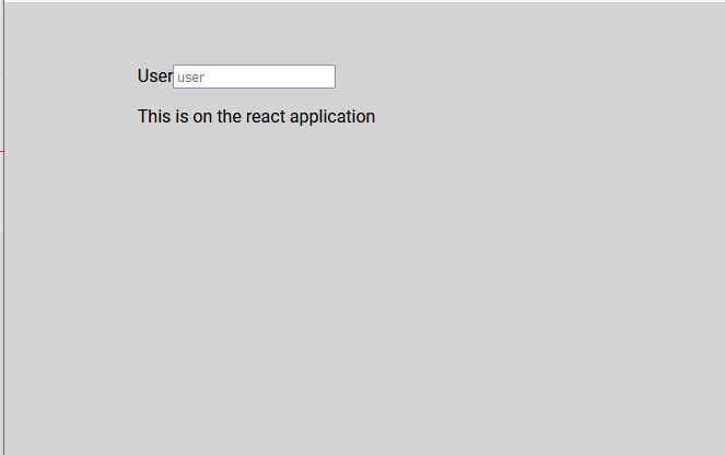
Applying first styles from styles.css
* {
box-sizing: border-box;
}
body {
background: lightgray;
}
main {
max-width: 800px;
width: 80%;
margin: auto;
padding: 48px;
}
And import in index.js or app.js
index.js
import React from 'react';
import ReactDOM from 'react-dom';
import App from './App';
import './styles.css';
ReactDOM.render(
<React.StrictMode>
<App />
</React.StrictMode>,
document.getElementById('root')
);

To Change the Fonts go to google fonts and select one https://fonts.google.com/

Select the fonts and with @import insert on styles.css
@import url('https://fonts.googleapis.com/css2?family=Roboto:wght@400;700&display=swap');
* {
box-sizing: border-box;
}
body {
background: lightgray;
font-family: 'Roboto', sans-serif;
}
main {
max-width: 800px;
width: 80%;
margin: auto;
padding: 48px;
}
Now install React Components following the page documentation. stop the react app run the command line command and restart the react app to continue the develop.
\react-form-validation> npm install --save styled-components
Import the style from styled-components and create a component
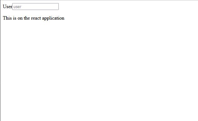
import React from "react";
import styled from "styled-components";
const App = () => {
return (
<main>
<Form_styled action="">
<label htmlFor="">User</label>
<input type="text" placeholder="user"></input>
<p>This is on the react application</p>
</Form_styled>
</main>
);
}
const Form_styled = styled.form`
background: #bbb;
`;
export default App;

Let´s organize the Components, putting them on one directory with their elements, in this case each of the group of inputs. This inside a directory elements with contains the react components for the form.
src/elements/formulary.js
import styled from "styled-components";
const colors = {
borde: '#0075FF',
error: '#bb2929',
success: '#1ed12d'
}
const Form_styled = styled.form`
display: grid;
grid-template-columns: 1fr 1fr;
gap: 20px;
@media (max-width: 800px) {
grid-template-columns: 1fr;
}
`;
export {Form_styled};
App.js
import React from "react";
import {Form_styled} from "./elements/formulary.js";
const App = () => {
return (
<main>
<Form_styled action="">
<div>
<label htmlFor="">User</label>
<input type="text" placeholder="user"></input>
<p>This is on the react application</p>
</div>
<div>
<label htmlFor="">User</label>
<input type="text" placeholder="user"></input>
<p>This is on the react application</p>
</div>
</Form_styled>
</main>
);
}
export default App;
To check and Test the grid order create a temporary input element.

And Check when the window is stretched, turning to one column.

Create Component Label and Formating it.
formulary.js
...
const Label = styled.label`
display: block;
font-weight: 700;
padding: 10px;
min-height: 40px;
cursor: pointer;
`;
export {Form_styled, Label};
the min-height is used in case no label is present then avoid the input field to move up.

To put the icon we need to install font awesome for react following the instructions from the page
npm i --save @fortawesome/fontawesome-svg-core
npm install --save @fortawesome/free-solid-svg-icons
npm install --save @fortawesome/react-fontawesome
following the instruction from the page, in the app.js file add
import { FontAwesomeIcon } from '@fortawesome/react-fontawesome'
import { faCoffee } from '@fortawesome/free-solid-svg-icons'
modify the App.js to group the input and the icon inside the same component. (div)
import React from "react";
import {Form_styled, Label, GroupInput, Input} from "./elements/formulary.js";
import { FontAwesomeIcon } from '@fortawesome/react-fontawesome'
import { faCheckCircle } from '@fortawesome/free-solid-svg-icons'
const App = () => {
return (
<main>
<Form_styled action="">
<div>
<Label htmlFor="">User</Label>
<GroupInput>
<Input type="text" placeholder="user"></Input>
<FontAwesomeIcon icon={faCheckCircle} />
</GroupInput>
<p>This is on the react application</p>
</div>
</Form_styled>
</main>
);
}
export default App;
The Components in formulary.js
const GroupInput = styled.div`
position: relative;
z-index: 90;
`;
const Input = styled.input`
width: 100%;
background: white;
border-radius: 5px;
height: 45px;
line-height: 45px;
padding: 0 40px 0 10px;
transition: .3s ease all;
border: 3px solid transparent;
`;
export {Form_styled, Label, GroupInput, Input};
Adjust the <p> to a formated component and formating the focus on the input
const Input = styled.input`
width: 100%;
height: 45px;
line-height: 45px;
border-radius: 5px;
background: white;
padding: 0 40px 0 10px;
transition: 0.3s ease all;
border: 3px solid trasparent;
&:focus {
border: 5px solid ${colors.border};
outline: none;
shadow-box: 3px 3px 5px rgba( 163,163, 163, 0.4);
}
`;
const MsgInputError = styled.form`
font-size: 12px;
color: ${colors.error};
margin-bottom: 0;
`;

To position the icon inside the input box, format the Icon component FontAwesomeIcon remplazing it with another new one called IconValidation this time.
App.js
import React from "react";
import { Form_styled, Label, GroupInput, Input, MsgInputError, IconValidation} from "./elements/formulary.js";
import { faCheckCircle } from "@fortawesome/free-solid-svg-icons";
const App = () => {
return (
<main>
<Form_styled action="">
<div>
<Label htmlFor="user">User</Label>
<GroupInput>
<Input type="text" placeholder="user" />
<IconValidation icon={faCheckCircle} />
</GroupInput>
<MsgInputError>This is on the react application</MsgInputError>
</div>
</Form_styled>
</main>
);
};
export default App;
formulary.js
const IconValidation = styled(FontAwesomeIcon)`
position: absolute;
right: 10px;
bottom: 14px;
z-index: 100;
font-size: 16px;
/*opacity: 0; */
`;
export { Form_styled, Label, GroupInput, Input, MsgInputError, IconValidation };

Add the checkbox and the form error message.
import React from "react";
import { Form_styled, Label, GroupInput, Input, MsgInputError, IconValidation} from "./elements/formulary.js";
import { FontAwesomeIcon } from "@fortawesome/react-fontawesome";
import { faCheckCircle ,faExclamationTriangle} from "@fortawesome/free-solid-svg-icons";
const App = () => {
return (
<main>
<Form_styled action="">
<div>
<Label htmlFor="user">User</Label>
<GroupInput>
<Input type="text" placeholder="user" id="user"/>
<IconValidation icon={faCheckCircle} />
</GroupInput>
<MsgInputError>This is on the react application</MsgInputError>
</div>
<div>
<label>
<input type="checkbox" name='terms' id='terms'/>
I Accept terms and conditions.
</label>
</div>
<div>
<p>
<FontAwesomeIcon icon={faExclamationTriangle}/>
<b>Error</b>Please, Check your data and accept terms.
</p>
</div>
</Form_styled>
</main>
);
};
export default App;

Also add the button and the success message.
<div>
<button type="submit" >Submit</button>
<p>Data send successfully!</p>
</div>

The elements are falling naturally in a grid of two columns. To format the elements on one column, create new components formated to take two columns with grid-column: span 2. additionally add more styles to the new components.
formulary.js
...
const DivTerms = styled.div`
grid-column: span 2;
input {
margin-right: 10px;
}
`;
const DivErrorFormMsg = styled.div`
grid-column: span 2;
height: 45px;
line-height: 45px;
background: ${colors.error};
padding: 0 15px;
border-radius: 3px;
p {
margin: 0;
}
b{
margin-left: 10px;
}
`;
const DivSubmitCentered = styled.div`
display: flex;
flex-direction: column;
align-items: center;
grid-column: span 2;
`;
const Button = styled.button`
height: 45px;
line-height: 45px;
width: 30%;
background: #0075ff;
color: white;
font-weight: bold;
border: none;
border-radius: 3px;
cursor: pointer;
transition: .1s easy all;
&:hover {
box-shadow: 5px 5px 5px rgba(163,163,163, 1);
background: ${colors.buttonover};
}
`;
const PMsgSuccess = styled.p`
font-size: 14px;
color: ${colors.success};
/*display: none*/;
`;
export { Form_styled, Label, GroupInput, Input, MsgInputError, IconValidation,
DivTerms, DivErrorFormMsg, DivSubmitCentered, Button, PMsgSuccess};
This components replace the elements on App.js
import React from "react";
import { Form_styled, Label, GroupInput, Input, MsgInputError, IconValidation,
DivTerms, DivErrorFormMsg, DivSubmitCentered, Button, PMsgSuccess} from "./elements/formulary.js";
import { FontAwesomeIcon } from "@fortawesome/react-fontawesome";
import { faCheckCircle ,faExclamationTriangle} from "@fortawesome/free-solid-svg-icons";
const App = () => {
return (
<main>
<Form_styled action="">
<div>
<Label htmlFor="user">User</Label>
<GroupInput>
<Input type="text" placeholder="user" id="user"/>
<IconValidation icon={faCheckCircle} />
</GroupInput>
<MsgInputError>This is on the react application</MsgInputError>
</div>
<DivTerms>
<label>
<input type="checkbox" name='terms' id='terms'/>
I Accept terms and conditions.
</label>
</DivTerms>
<DivErrorFormMsg>
<p>
<FontAwesomeIcon icon={faExclamationTriangle}/>
<b>Error</b>Please, Check your data and accept terms.
</p>
</DivErrorFormMsg>
<DivSubmitCentered>
<Button type="submit" >Submit</Button>
<PMsgSuccess>Data send successfully!</PMsgSuccess>
</DivSubmitCentered>
</Form_styled>
</main>
);
};
export default App;

Once we got the format of the main elements, we can hide the elements like error or success relatives uncommenting the instructions in css and using a false flag on app.js

Let´s create more elements for input data, we could duplicate the code or create a Parameterized Component.
Duplicating code, not recomended.
const App = () => {
return (
<main>
<Form_styled action="">
<div>
<Label htmlFor="user">User</Label>
<GroupInput>
<Input type="text" placeholder="user" id="user"/>
<IconValidation icon={faCheckCircle} />
</GroupInput>
<MsgInputError>This is on the react application</MsgInputError>
</div>
<div>
<Label htmlFor="user">email</Label>
<GroupInput>
<Input type="email" placeholder="email" id="email"/>
<IconValidation icon={faCheckCircle} />
</GroupInput>
<MsgInputError>This is on the react application</MsgInputError>
</div>
<DivTerms>
<label>
<input type="checkbox" name='terms' id='terms'/>
I Accept terms and conditions.
</label>
</DivTerms>
{false && <DivErrorFormMsg>
<p>
<FontAwesomeIcon icon={faExclamationTriangle}/>
<b>Error</b>Please, Check your data and accept terms.
</p>
</DivErrorFormMsg>}
<DivSubmitCentered>
<Button type="submit" >Submit</Button>
<PMsgSuccess>Data send successfully!</PMsgSuccess>
</DivSubmitCentered>
</Form_styled>
</main>
);
};

eot
No hay comentarios:
Publicar un comentario