CSS Walk 5 Images
Let´s use an image in an html file
<!DOCTYPE html>
<html lang="en">
<head>
<meta charset="UTF-8" />
<meta http-equiv="X-UA-Compatible" content="IE=edge" />
<meta name="viewport" content="width=device-width, initial-scale=1.0" />
<title>CSS course</title>
<link rel="stylesheet" type="text/css" href="./css/styles.css" />
</head>
<body>
<img src="./images/css3.png" width="500" alt="imagencss3" />
</body>
</html>
Initialy we define the width of the image in the html file, but we can override this property from the css file
img {
width: 100px;
}
We can deform the image with height and width
img {
width: 700px;
height: 100px;
}

To maintaing the aspect ratio put one of those parameters as auto.
img {
width: 700px;
height: auto;
}
Let´s put the image inside a div
<body>
<div>
<img src="./images/css3.png" width="500" alt="imagencss3" />
</div>
</body>
</html>
And assign css properties to see the modifications on the div and img
div {
background: rgb(173, 193, 250);
width: 800;
}
img {
width: 300px;
height: auto;
}

div {
background: rgb(173, 193, 250);
width: 800;
}
img {
width: 100%;
height: auto;
}

div {
background: rgb(173, 193, 250);
width: 100%;
}
img {
width: 300px;
height: auto;
margin: auto;
display: block;
}
...

To round the corners use
img {
width: 300px;
height: auto;
border-radius: 20px;
}
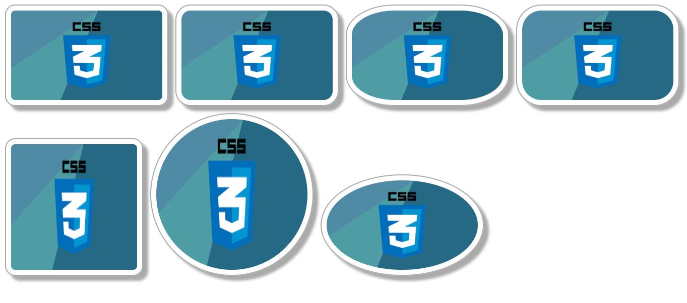
Let´s try may variants of the css capabilities on images
<body>
<div>
<img src="./images/css3.png" width="500" alt="imagencss3" />
<img
class="class-a"
src="./images/css3.png"
width="500"
alt="imagencss3"
/>
<img
class="class-b"
src="./images/css3.png"
width="500"
alt="imagencss3"
/>
<img
class="class-c"
src="./images/css3.png"
width="500"
alt="imagencss3"
/>
<img
class="class-d"
src="./images/css3.png"
width="500"
alt="imagencss3"
/>
<img
class="class-scuare"
src="./images/css3.png"
width="500"
alt="imagencss3"
/>
<img
class="class-circled"
src="./images/css3.png"
width="500"
alt="imagencss3"
/>
</div>
</body>
...
div {
width: 100%;
}
img {
width: 300px;
height: auto;
border-radius: 20px;
}
.class-a {
border-radius: 30px;
}
.class-b {
border-radius: 30%;
}
.class-c {
border-radius: 50px;
}
.class-d {
border-radius: 50%;
}
.class-scuare {
width: 300px;
height: 300px;
}
.class-circled {
width: 300px;
height: 300px;
border-radius: 50%;
}

Setting box-shadow to each img
img {
width: 300px;
height: auto;
border-radius: 20px;
box-shadow: 10px 10px 5px #aaa;
margin: 10px;
}
.class-a {
border-radius: 30px;
box-shadow: 10px 10px 5px #aaa;
margin: 10px;
}
.class-b {
border-radius: 30%;
box-shadow: 10px 10px 5px #aaa;
margin: 10px;
}
.class-c {
border-radius: 50px;
box-shadow: 10px 10px 5px #aaa;
margin: 10px;
}
.class-d {
border-radius: 50%;
box-shadow: 10px 10px 5px #aaa;
margin: 10px;
}
.class-scuare {
width: 250px;
height: 250px;
box-shadow: 10px 10px 5px #aaa;
margin: 10px;
}
.class-circled {
width: 300px;
height: 300px;
border-radius: 50%;
box-shadow: 10px 10px 5px #aaa;
margin: 10px;
}
...

Simplifying css code and adding padding and border
img {
width: 300px;
height: auto;
border-radius: 20px;
box-shadow: 10px 10px 5px #aaa;
margin: 10px;
padding: 10px;
border: 2px solid darkgray;
}
.class-a {
border-radius: 30px;
}
.class-b {
border-radius: 30%;
}
.class-c {
border-radius: 50px;
}
.class-d {
border-radius: 50%;
}
.class-scuare {
width: 250px;
height: 250px;
}
.class-circled {
width: 300px;
height: 300px;
border-radius: 50%;
}
...

eot
No hay comentarios:
Publicar un comentario